COLOR 102: Selecting Colors to Fit the Right Mood
Gina Bonura is a Kitchen and Bath Designer at Alure Home Improvements. Read more of her thoughts on color at COLOR 101: How to Make Your Home Project Go from ‘Nice’ to ‘Wow‘
Sometimes it’s overwhelming to select colors for the kitchen and bathroom in the home.
Try imaging how you want to feel in the space. Deciding whether you want to come home to a restful retreat or an energetic space can help you determine what colors to choose. Color has a great deal to do with mood and vice versa. The colors you surround yourself with in life are very closely connected to the way you feel.
Do you love yellow? Chances are you are a cheerful person. Are you drawn to blue? You are most likely laid back and calm -or want to be! That’s what color does! It shows the world how we feel, and can help us feel the way we want. It’s no accident that many restaurants use red and orange tones, or that many hospitals and offices use blues and greens. Reds and oranges tend to evoke hunger and excitement, whereas blues and greens are calming and safe.
How to Select Colors to Fit a Mood
When selecting colors for your kitchen or bathroom, it is helpful to consider the following:
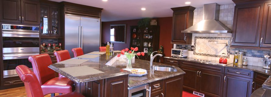
- Red – Energy, passion, vitality, ambition. Too much red can give you feelings of danger, anger and frustration
- Pink -Warmth, nurture, love. Too much pink may be considered too girly.
- Orange – Digestion, joy, enthusiasm, success, relief of self-pity.
- Yellow – Optimism, self-confidence, joy, happiness, cheerfulness. Too much causes confusion and anxiety.
- Green – Relaxation, healing, comfort, calm, safety.
- Blue – Soothing, calming, creativity, clarity, trust, loyalty. Blue suppresses appetite. Too much blue can be depressing.
- Purple – Luxury, intuition, peace, ambition, mystery, magic, imagination.. Purple also suppresses appetite.
- Brown – Stability and security. Too much brown can be boring.
- Black – Mysterious, protective, passive. Too much black is depressing
- White – Purity, peace, comfort. Too much – cold, sterile.
- Grey – Independence, self-reliance.
How do you approach color when doing a home project?
-Gina
- Additions and New Construction
- All Exteriors
- Alterations
- Basements
- Bathrooms
- Customer Service
- Customer Stories
- Decks
- Design & Planning Show
- DIY
- Doors
- Educational Resources
- Extreme Makeover Home Edition
- Fashion Show
- General Remodeling
- Green Living
- Handyman Home Services
- Home Decor
- Home Entertainment
- Home Improvement
- Home Improvements
- How to Tips
- In The Community
- Kitchens
- Off-the-Wall Remodeling Stories
- Remodeling
- Resources
- Roofing
- Siding
- Social Media
- Sunrooms
- Tips & Tricks
- Trends
- Windows
