Home design trends: Adding a pop of color
When making decisions about a home design or improvement project, it’s always helpful to pay attention to the latest and emerging trends. And, right now, it seems to be all about strategically using color to make a statement.
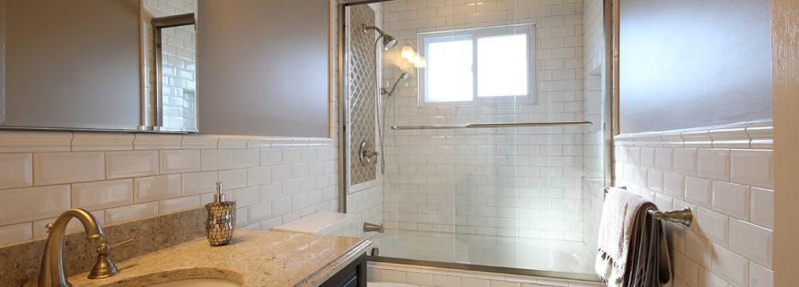
Adding a pop of color to a room is appealing for a number of reasons. It allows you to add some excitement to an otherwise dull kitchen or bathroom and, because it is typically confined to a concentrated area, it’s easy to change if and when you feel the need to.
“A colorful backsplash can add excitement to the kitchen.”
Neutral palettes
Neutral colors – like white and cream shades – are great to use if you want to brighten up the area. When used across multiple surfaces, they achieve a level of continuity that can make a room feel bigger and more spacious. Alure Designer Sherry Gossett explained that this is why white and cream cabinets are – and likely will continue to be – the most popular choice for kitchens. However, to ensure softer shades don’t look bland, more homeowners are offsetting them with pops of color.
“In the kitchen, color can be brought in with excitement on the backsplash,” Gossett explained. “Bold, solid color backsplashes with details in pattern changes are popular. For a more decorative look, backsplashes may also be completely covered in design.”
Trending colors
With its ability to add instant cheer and radiance to a room, yellow is one of the colors gaining popularity in the home. Pale shades are best for creating a more relaxed and comfortable environment, whereas more vivid hues, like lemon yellow, can be more confident and impactful.
Another color seeing increased affection from homeowners is gray.

“Gray is the new black,” said Gossett, adding that it has become increasingly popular to use this in the home ever since the release of Fifty Shades of Grey. Whether it is a soft, calm gray or a dark, charcoal, one of the great things about it is that is pairs well with almost any color, from lime green to crimson red.
Tips for adding color in the home
To pull off a pop of color in your kitchen, bathroom or other area of your home, you need to go about it strategically. Adding too much can make it look harsh and cluttered. Also, you want to make sure the colors you choose complement one another.
To ensure you choose a color scheme that is visually appealing, it is highly recommended you follow the 60-30-10 rule. Essentially, this popular interior design concept is a breakdown of how much of one color to use. For example, the main, primary color – likely a neutral tone – will cover 60 percent of the room, 30 percent will be a second, complementary color and 10 percent a bolder, vibrant accent (the “pop” of color).
A helpful strategy to use when adding a pop of color to the home is to focus on complementary colors, which are those that sit opposite each other on the color wheel. For example, if you are trying to decide on an accent color that will work well with blue walls, consider a shade of orange.
- Additions and New Construction
- All Exteriors
- Alterations
- Basements
- Bathrooms
- Customer Service
- Customer Stories
- Decks
- Design & Planning Show
- DIY
- Doors
- Educational Resources
- Extreme Makeover Home Edition
- Fashion Show
- General Remodeling
- Green Living
- Handyman Home Services
- Home Decor
- Home Entertainment
- Home Improvement
- Home Improvements
- How to Tips
- In The Community
- Kitchens
- Off-the-Wall Remodeling Stories
- Remodeling
- Resources
- Roofing
- Siding
- Social Media
- Sunrooms
- Tips & Tricks
- Trends
- Windows
